

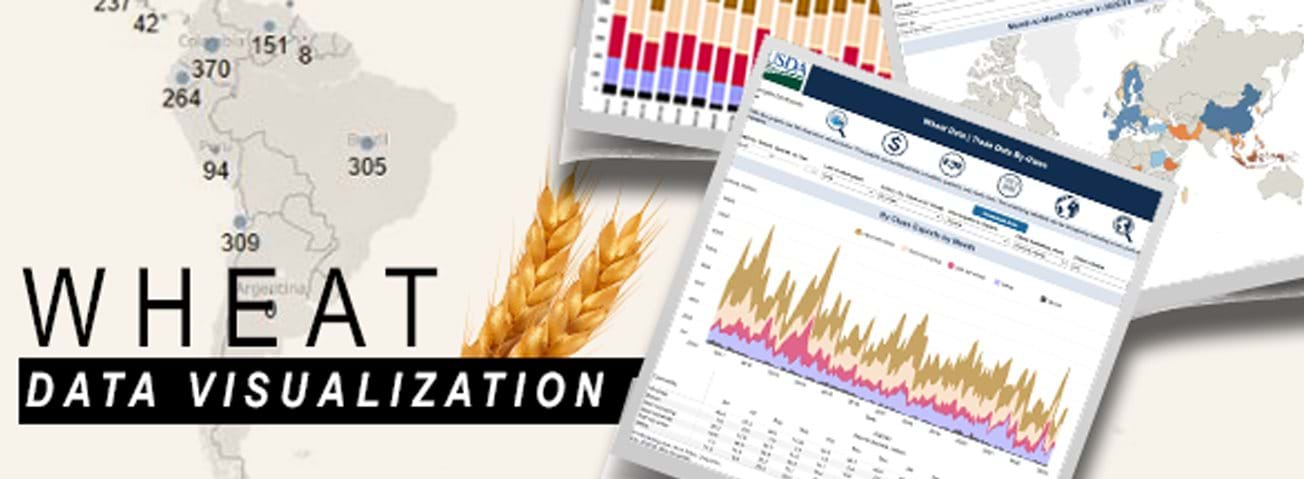
New Visualization Tool Offers Interactive Ways To Explore Wheat Statistics
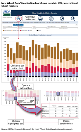
USDA, Economic Research Service (ERS) has developed an interactive tool to explore trends in U.S. and international wheat markets. Now available on the ERS website, the Wheat Data Visualization tool works on all types of devices with many mobile-friendly options. The tool provides graphic overviews of the wide array of data ERS publishes each month in the Wheat Data product—a resource that includes statistics on the five classes of wheat: hard red winter, hard red spring, soft red winter, white, and durum, all by year and by quarter. Monthly domestic and international price data are included, as well as monthly trade data by product and class, interactive maps of U.S. export markets, and a feature for mapping changes to the data from the USDA, Foreign Agricultural Service’s Production, Supply, and Distribution database.
Each month, ERS updates the Wheat Data Visualization tool after USDA releases the World Agricultural Supply and Demand Estimates (WASDE). The tool includes calculations and data from the WASDE; U.S. Department of Commerce, Bureau of the Census; USDA, National Agricultural Statistics Service; and several other sources. Some data series in the visualization date as far back as 1950 and take users to the present day.
Wheat Data Visualization users can flip through six dashboards by clicking on navigation icons at the top of each dashboard. Options for interactive visualizations include line, area, and bar graphs. One dashboard, showing U.S. wheat trade destinations around the world, features an interactive map that allows users to toggle over different locations and view U.S. wheat trade flows over time. The Trade Data By-Class dashboard highlights a series unique to the ERS Wheat Data product with monthly, quarterly, and marketing year data on U.S. wheat exports by class. Drop-down menus allow users to select their preferred view (for example, by stacked area or separate line graphs), choose between export or import data, and choose the marketing years and classes to appear in the visualization. A similar dashboard is available for monthly, quarterly, and marketing year views of U.S. wheat trade by product type (grain, flour, and products). An overview dashboard provides quarterly and marketing year U.S. wheat supply and distribution statistics, including by-class data. To view the underlying data for some of the dashboards, users can click on a data point and generate a table that contains the data series for a selected marketing year. In addition, the complete dataset that supports each dashboard can be downloaded through a “Download Data” button below the navigation icons.
For more information on how to use the Wheat Data Visualization tool, a recording of a data training webinar for wheat data is available on the ERS website.
Wheat Data Visualization, by Bryn Swearingen, USDA, Economic Research Service, April 2024
Wheat Outlook: April 2023, by Andrew Sowell and Bryn Swearingen, ERS, April 2023
Wheat, by Andrew Sowell and Bryn Swearingen, USDA, Economic Research Service, October 2023
Data Visualizations, USDA, Economic Research Service, April 2024
Wheat Data, by Andrew Sowell , USDA, Economic Research Service, April 2024
Data Training Webinar: Wheat Data, by Sowell, A. and Swearingen, B., U.S. Department of Agriculture, Economic Research Service, May 24, 2023